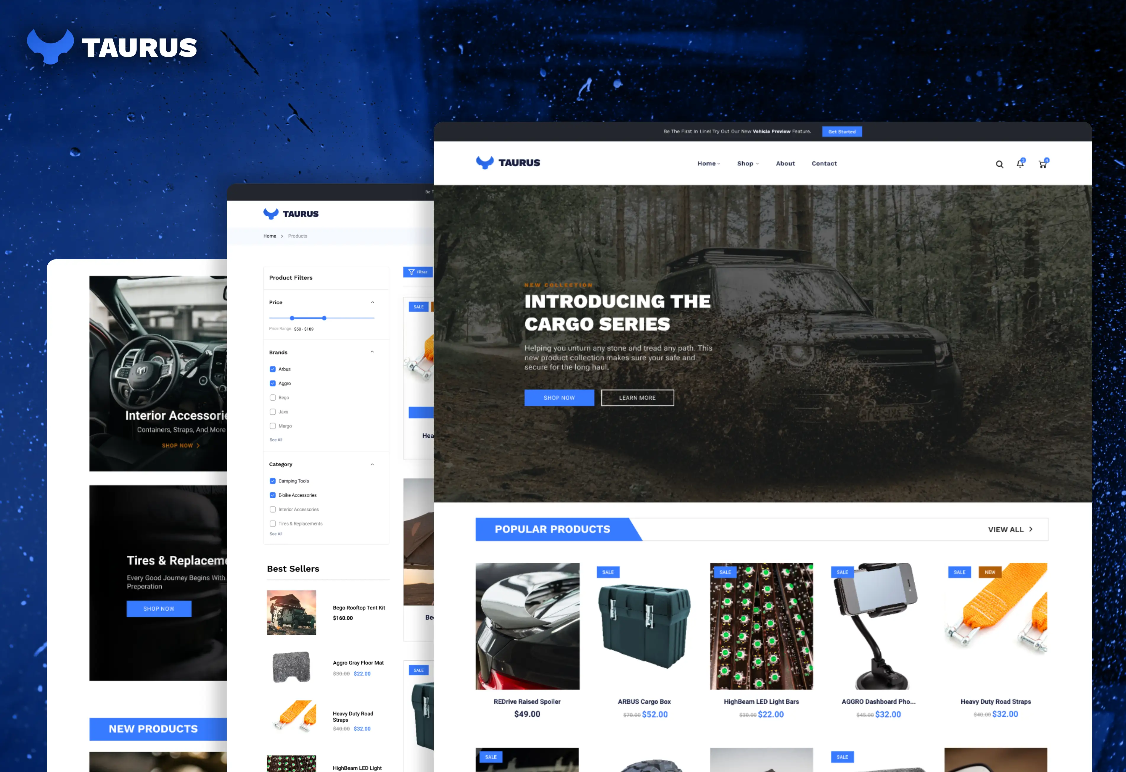
Taurus cover image

Taurus Website

Role: UX/UI Designer | QA Tester

Project Goal

UX/UI Design for Taurus, a B2C vehicle parts and accessories ecommerce business.

As an ecommerce business, the primary goal was to create a straightforward user experience with a strong focus on optimizing conversions and a positive user buying experience. A great deal of testing, research, and documentation was carried out to ensure a high-converting website.

Below you will find a more in-depth look at my full process and solution for this project.
P1 - Planning
I began with planning and project analysis. This phase allows me to understand more about the brand, what it represents, and document key project information such as the target audience, required features, the minimally viable product (MVP), and examples for ideation.

I also define a clear scope, timeline, and budget if applicable which helps to keep the project on track. This stage is all about laying the groundwork and is largely about information-gathering.

For this project in particular, I researched target audience pain points, competing products, and technical specifications for conversion of the design to a Shopify theme using Liquid. My largest focus was on understanding the UX/UI impacts on converstion rates and how to best drive sales for new and returning customers.
P2 - Ideation
With the groundwork laid out, I began the ideation phase. This phase is highly-iterative and typically begins with rough sketches and ends with a fully-designed mockup. The sketches allow me to brainstorm a wide variety of ideas for the layout and user experience of the site. In some projects, I will also draft a user flow chart for visualizing the user experience and page interaction. This phase is less technical and more creative; therefore, I make sure not to limit the flow of ideas and keep an open mind.

Using the sketches, I moved on to building wireframes. The wireframes create a "framework" for the design aspects and layout moving forward. Consideration was also shown to site responsiveness, therefore separate wireframes were included for desktop, tablet, and mobile sizes respectively.

I rounded off this phase by creating a complete set of mockups with color, imagery, and icons that are ready to be translated into a fully-functional app by the development team. This was all drafted and designed in Lunacy.
P3 - Content
At this phase, I will manage the process of creating content for the site. This is a short, transitional period that occurs after the content has been created and before development begins.

Typically, I will create basic graphics, the site favicon, write copy, and gather media like images and videos for use on the site. I will then package this all up and prepare it for development.

For this project, I created a simple style guide, gathered icons and product images, and converted UI components into workable code for development.
P4 - Development
This phase encompasses a much larger list of tasks that involve building out the frontend of the project. It ends with a MVP that has core features, hosting and domain setup, and any third-party API's plugged in and ready for deployment. Progress will typically be monitored via Github and testing will occur after site goes live.

This particular project did not involve development as it was simply a UX/UI design project. Though the design was converted into a Shopify theme for testing, using Liquid.

Samples

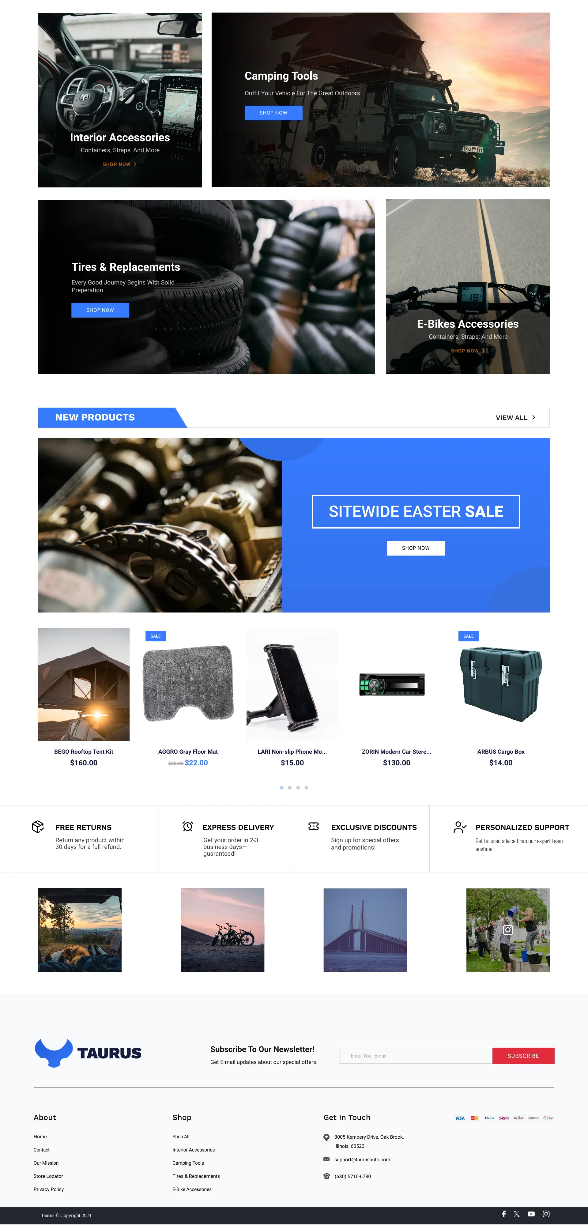
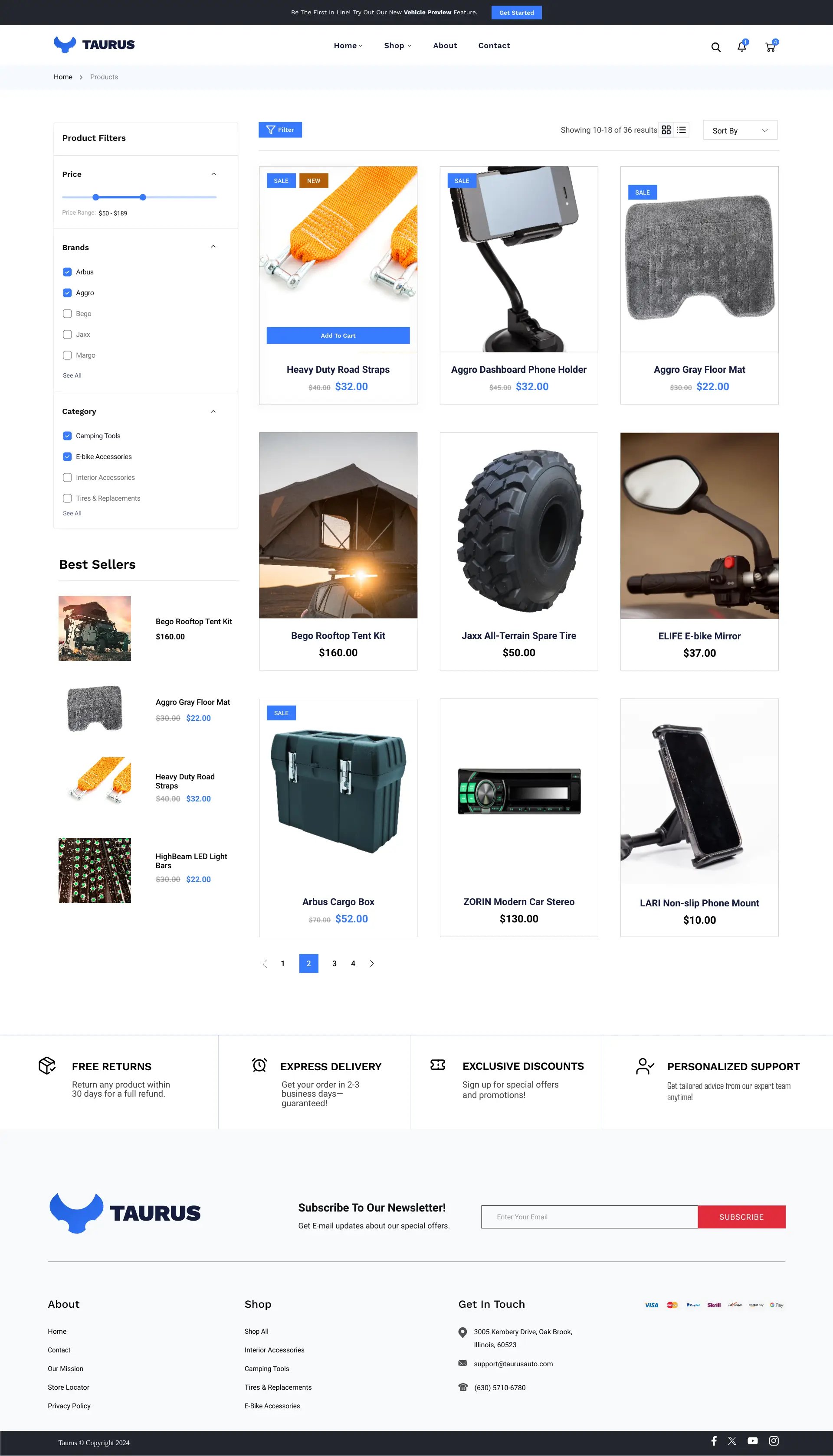
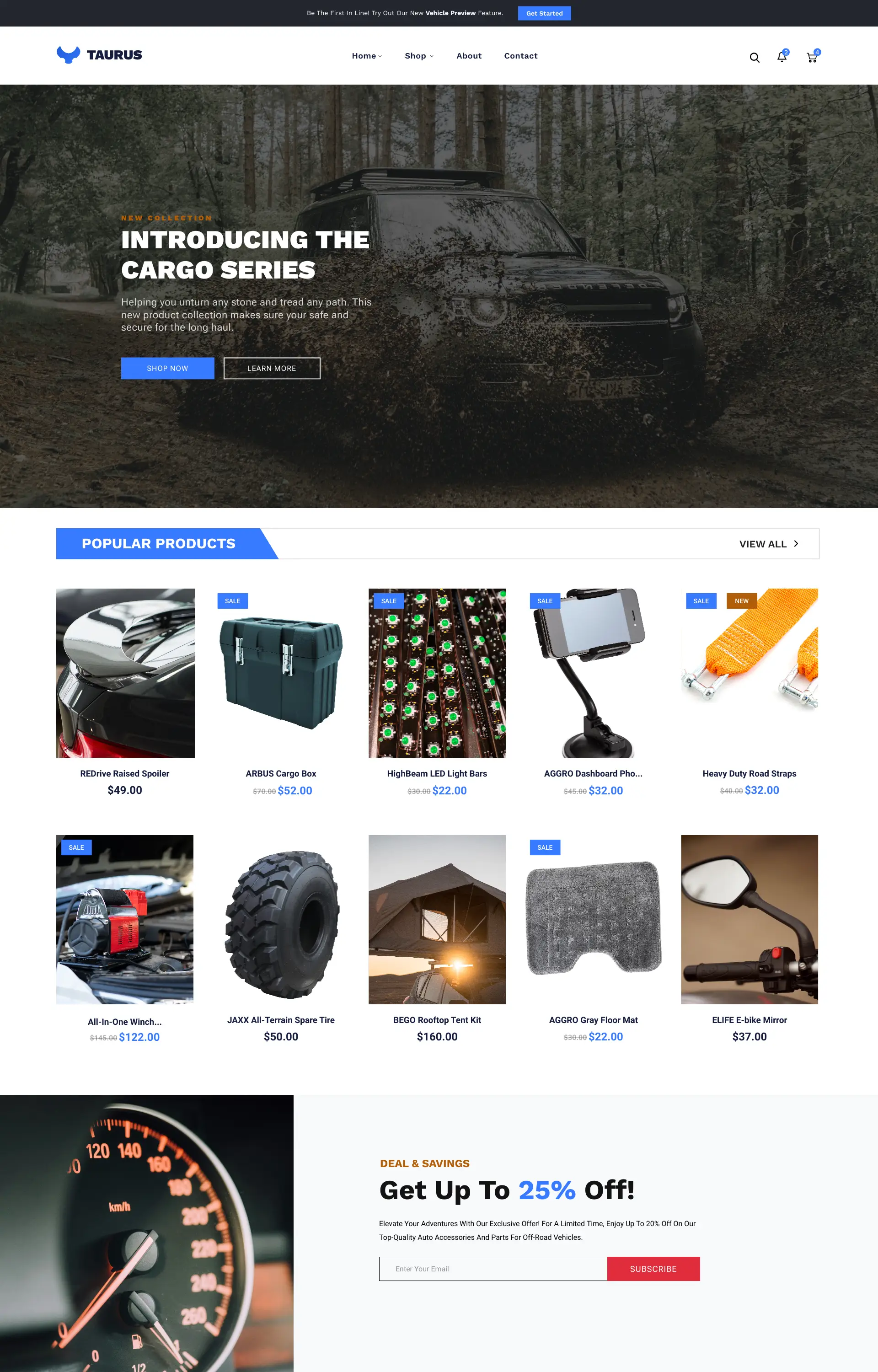
taurus home page part 1 taurus home page part 2 taurus shop page