rogue wizard studios cover image

Rogue Wizard Studios

Role: UX/UI Designer | Project Manager

Project Goal

UX/UI Design for a highly-creative, fantasy-oriented indie game studio. This brand appeals to an audience that enjoys story-driven adventure games with high-fantasy themes.

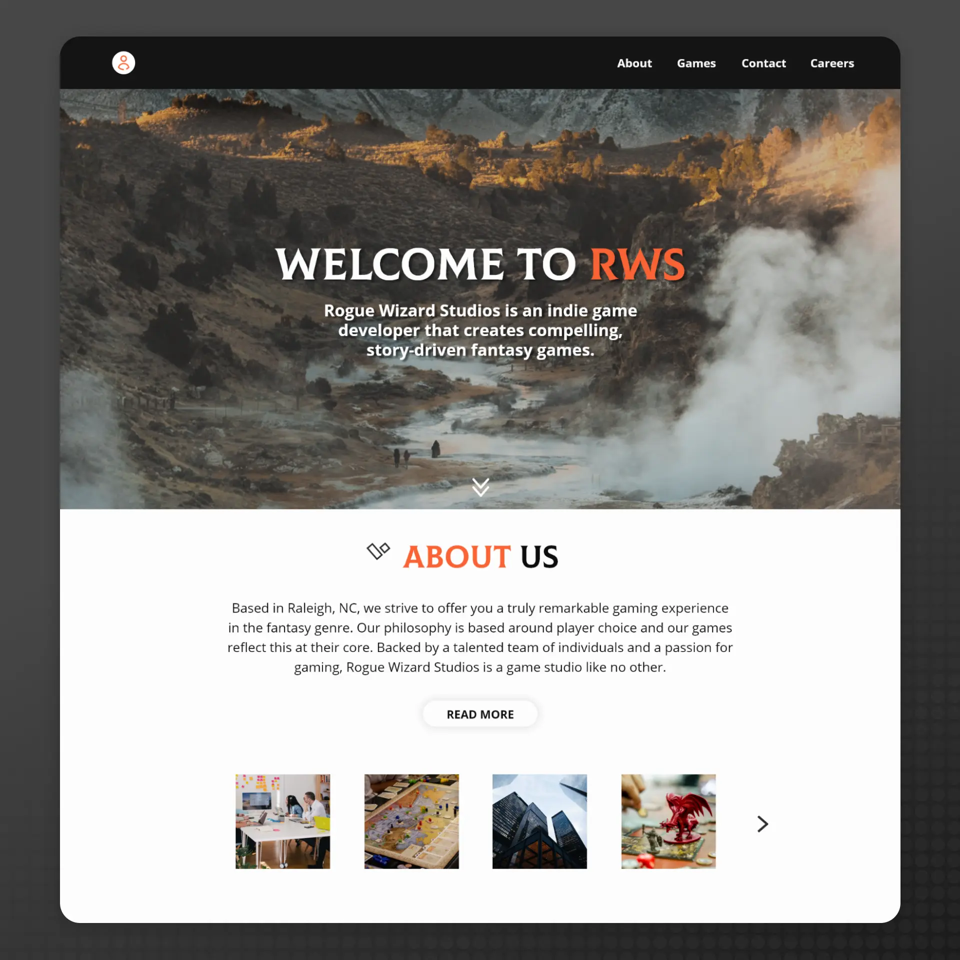
The goals for this project focused on creating an enticing and standout landing page design for the RWS brand. It was important that we considered the target audience, the brand, and how we could best convey to users what RWS represented and what type of product they offered. This would then drive users to target CTA's with the ultimate goal of increasing conversions and ultimately helping to scale the business.

Below you will find a more in-depth look at my full process and solution for this project.
P1 - Planning
I began with planning and project analysis. This phase allows me to understand more about the brand, what it represents, and document key project information such as the target audience, required features, the minimally viable product (MVP), and examples for ideation.

I also define a clear scope, timeline, and budget if applicable which helps to keep the project on track. This stage is all about laying the groundwork and is largely about information-gathering; communication is key.

For this project, I gathered data on what customers were looking for in this niche to later tie that in to the final design. As for inspiration and standards, I combed through channels frequented by the target audience which included Twitch.tv, YouTube, Gamespot, and various other websites. I aimed to gather a large body of information to help me empathize with the target audience and create a more targeted design later on.
P2 - Ideation
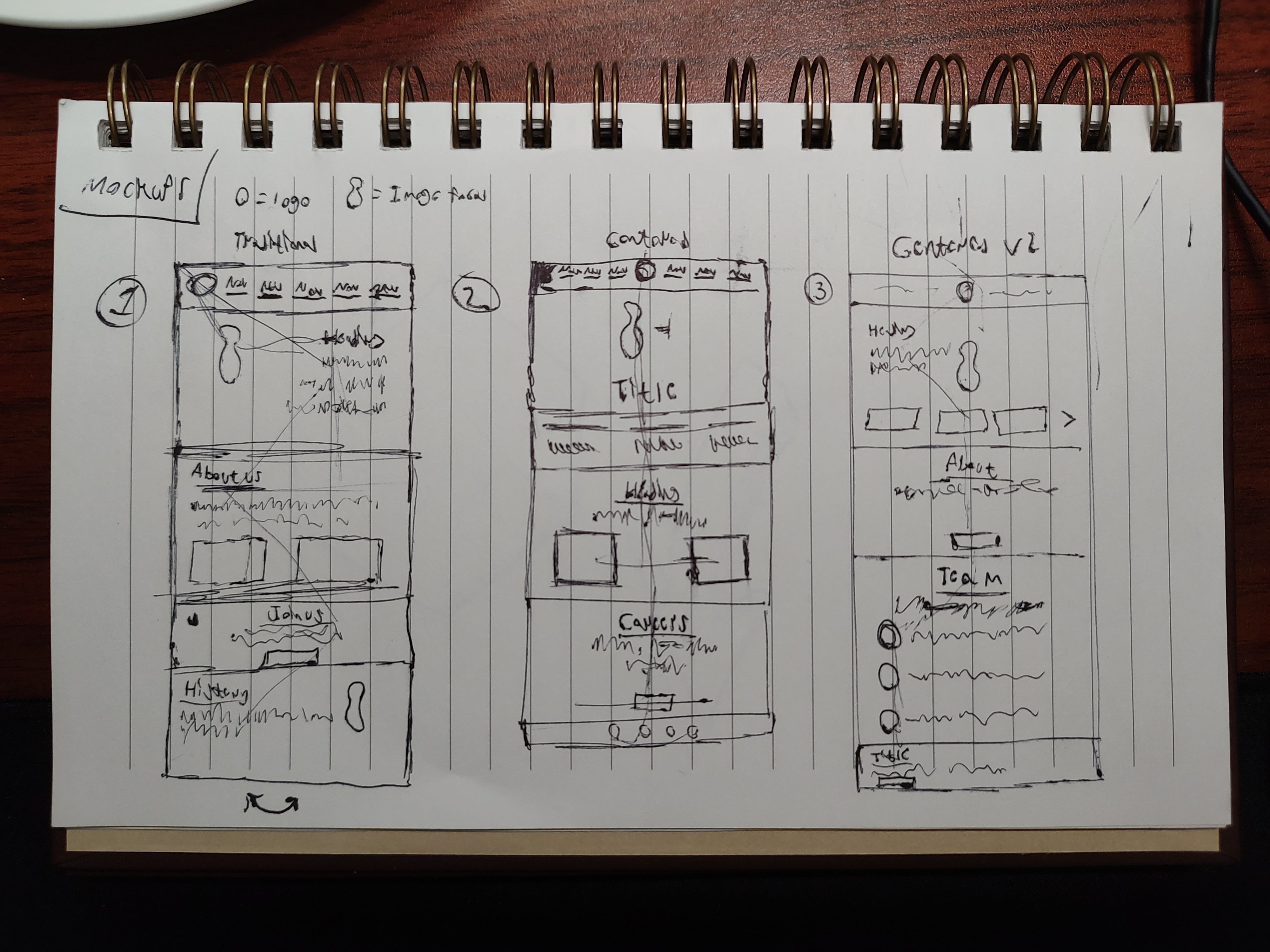
With the groundwork laid out, I began the ideation phase. This phase is highly-iterative and typically begins with rough sketches and ends with a fully-designed mockup. The sketches allow me to brainstorm a wide variety of ideas for the layout and user experience of the site. In some projects, I will also draft a user flow chart for visualizing the user experience and page interaction. This phase is less technical and more creative; therefore, I make sure not to limit the flow of ideas and keep an open mind.

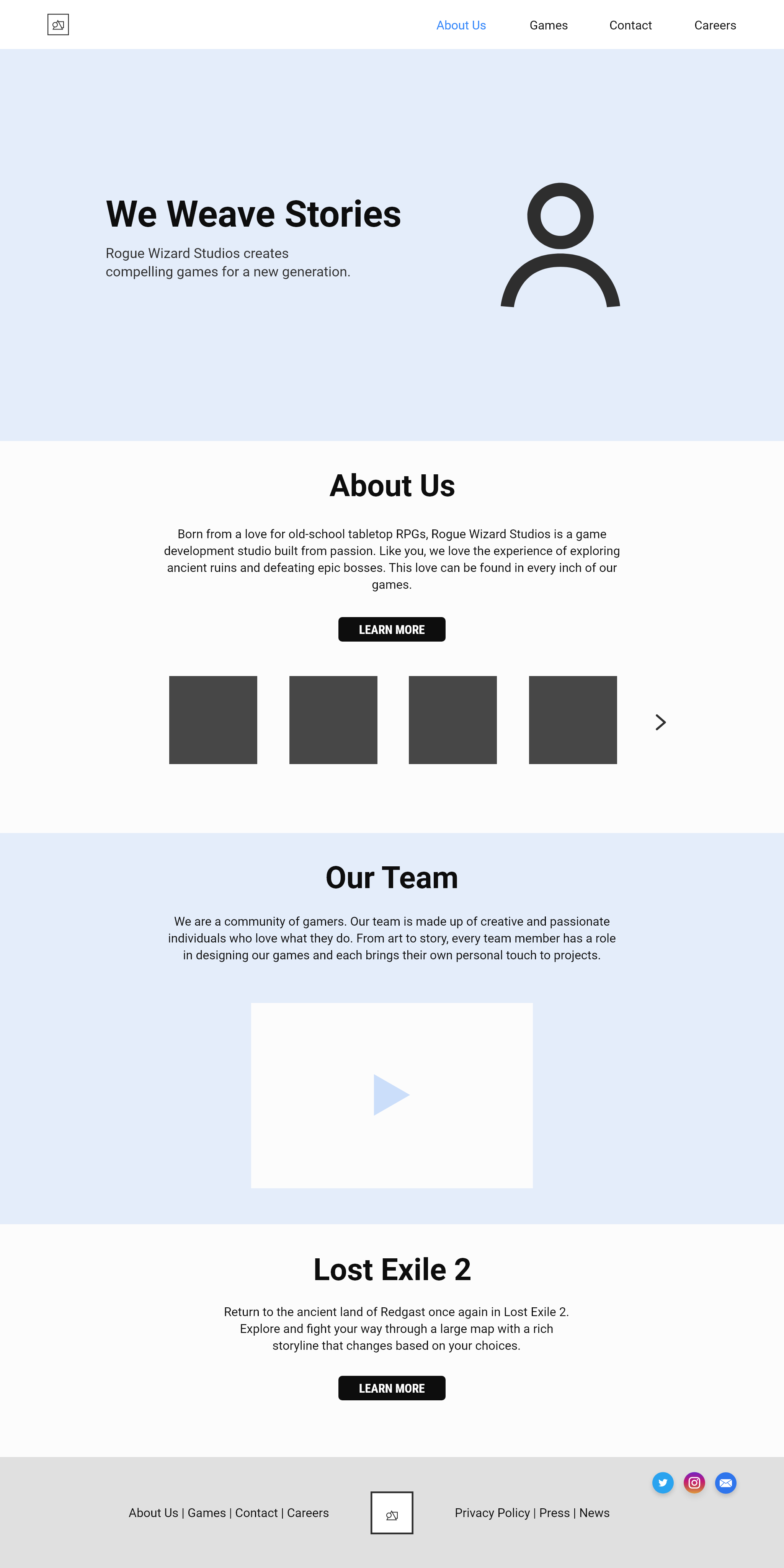
Using the sketches, I moved on to building wireframes. Based on the sketches, I laid out elements section by section with a focus on eye-catching imagery for strong product indentification. Consideration was also shown to site responsiveness, therefore separate wireframes were included for desktop, tablet, and mobile sizes respectively.

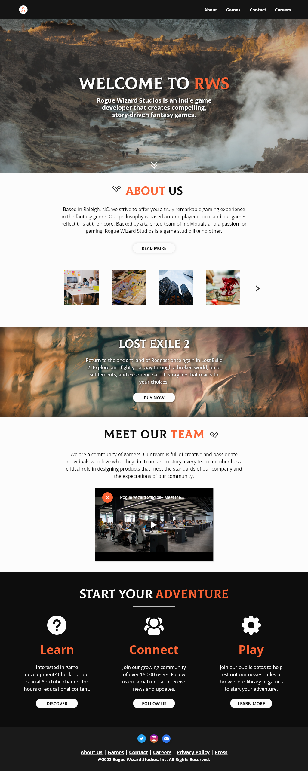
Lastly, I moved on to creating a set of fully-designed mockups with color, imagery, and icons that were ready to be translated into a fully-functional website.
P3 - Content
At this phase, I will take care of creating content for the site as it is needed. This is a short, transitional period that occurs after the final mockup has been created and before development begins.

Typically, I will create basic graphics, the site favicon, write copy, and gather media like images and videos for use on the site. I will then package this all up and prepare it for development.

For this project I carried out a few tasks:
  • Exported and packaged graphics, icons, and imagery. Links and attributions included for specific media.
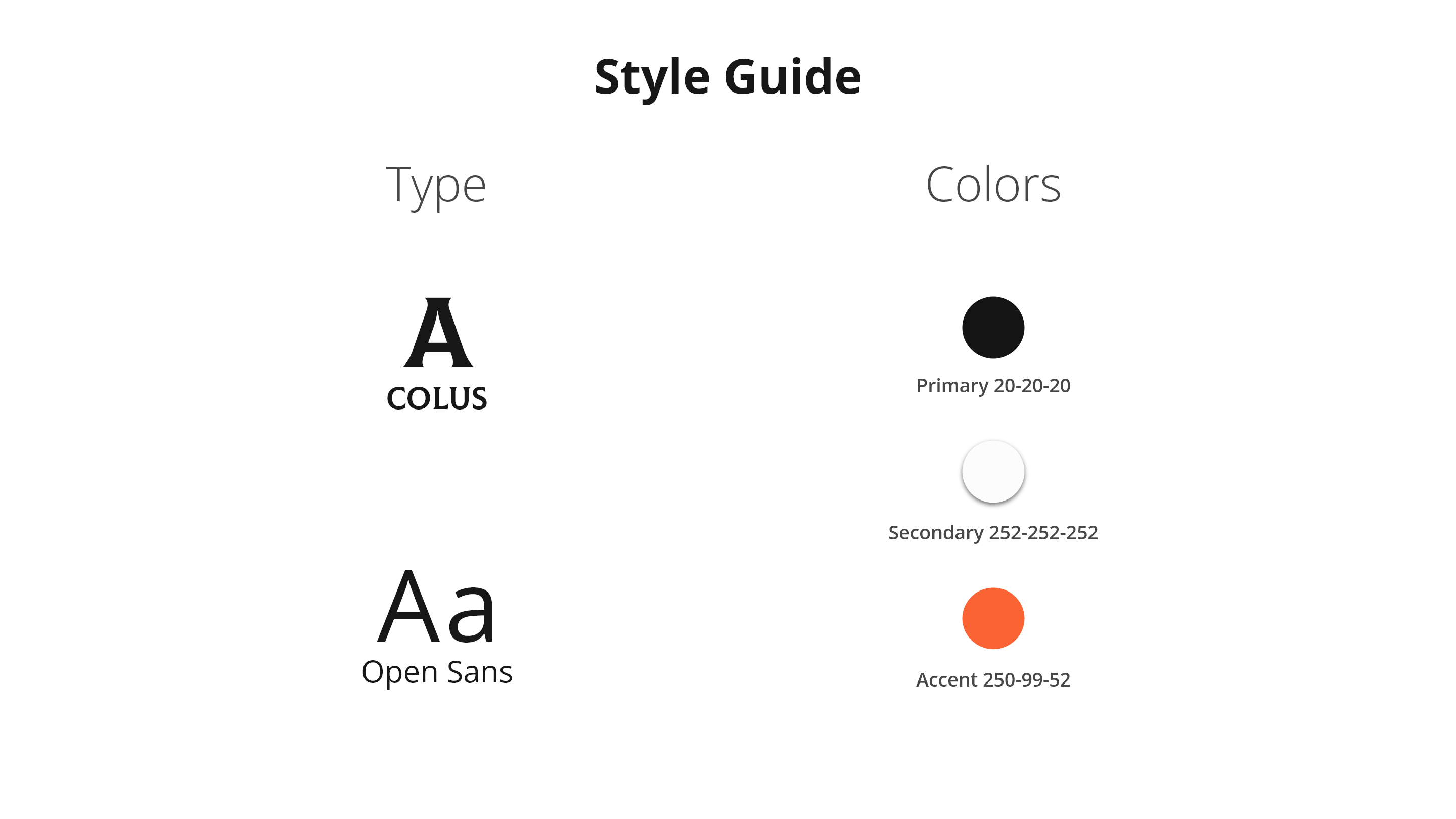
  • Exported documentation as PDFs containing key data such as branding guidelines, tools, and general notes. Previews were also exported for reference.
P4 - Development
This phase encompasses a much larger list of tasks that involve building out the frontend of the project. It ends with a MVP that has core features, hosting and domain setup, and any third-party API's plugged in and ready for deployment. Progress will typically be monitored via Github and testing will occur after site goes live.

This particular project did not involve development as it was simply a landing page design project.

Samples