public font curation cover image

Public Font Curation

Role: Front-end Developer | UX/UI Designer | Project Manager

Project Goal

UX/UI Design & Frontend Development for a website that helps designers and developers find high-quality fonts for their next project.

As a designer, I found it tedious to continously search for new fonts to include in my projects. While platforms such as Google Fonts offer a large array of fonts for free, searching through hundreds of fonts to find the right ones can be a timesink. This is where the Public Font Curation comes to the rescue, offering a handpicked curation of great fonts in an easy-to-browse format.

Below you will find a more in-depth look at my full process and solution for this project.
P1 - Planning
I began with planning and project analysis. This phase allows me to understand more about the brand, what it represents, and document key project information such as the target audience, required features, the minimally viable product (MVP), and examples for ideation.

I also define a clear scope, timeline, and budget if applicable which helps to keep the project on track. This stage is all about laying the groundwork and is largely about information-gathering; communication is key.

For this project, I gathered data on competitors to determine trends and areas for improvement. Simplicity was a defining trait for this project and I wanted to include only the most crucial information. I also outlined what features would be required and which features would be nice bonuses to have.
P2 - Ideation
With the groundwork laid out, I began the ideation phase. This phase is highly-iterative and typically begins with rough sketches and ends with a fully-designed mockup. The sketches allow me to brainstorm a wide variety of ideas for the layout and user experience of the site. In some projects, I will also draft a user flow chart for visualizing the user experience and page interaction. This phase is less technical and more creative; therefore, I make sure not to limit the flow of ideas and keep an open mind.

Using the sketches, I moved on to building wireframes. The design ultimately began moving in the direction of a modern, clean, and straightforward UI and one of my biggest inspirations were brands such as Apple and Microsoft. Consideration was also shown to site responsiveness, therefore separate wireframes were included for desktop, tablet, and mobile sizes respectively.

Lastly, I moved on to creating a set of fully-designed mockups with color, imagery, and icons that were ready to be translated into a fully-functional website.
P3 - Content
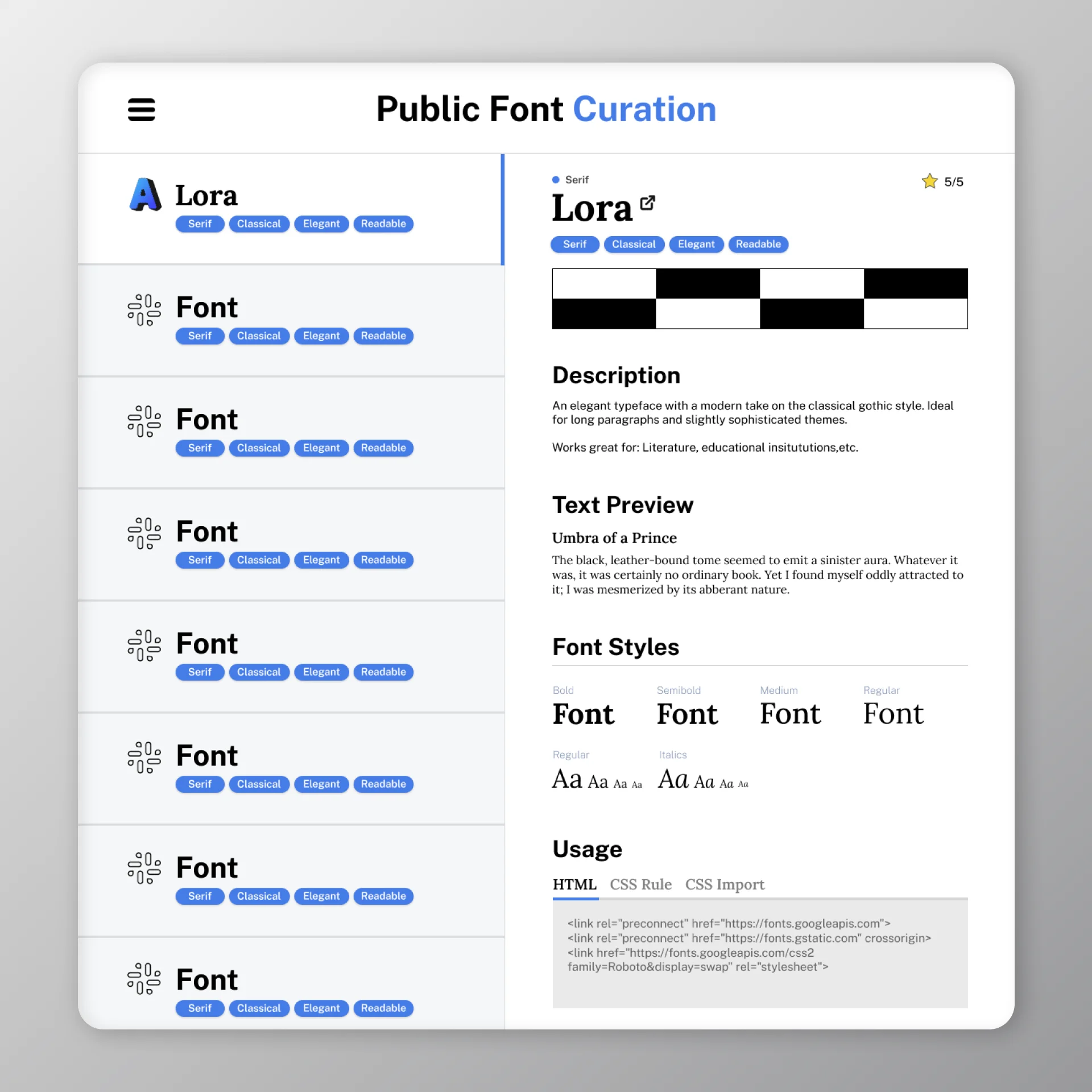
At this phase, I will take care of creating content for the site as it is needed. This is a short, transitional period that occurs after the final mockup has been created and before development begins.

Typically, I will create basic graphics, the site favicon, write copy, and gather media like images and videos for use on the site. I will then package this all up and prepare it for development.

For this project I carried out a few tasks:
  • Exported and packaged graphics, icons, and imagery.
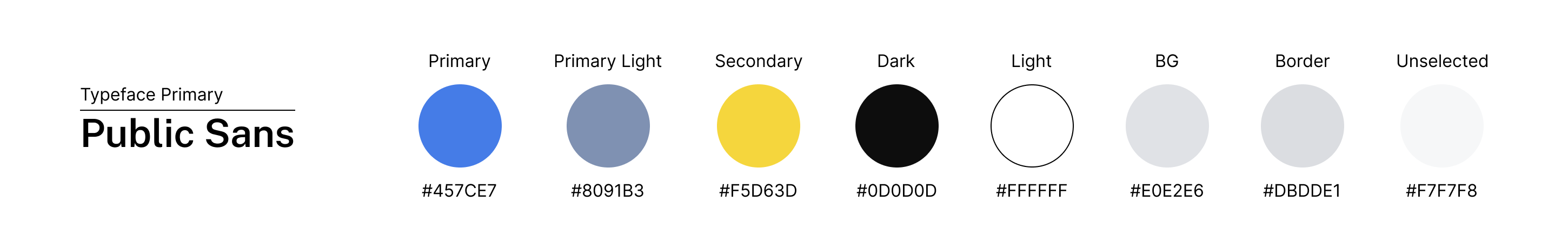
  • Exported documentation as PDFs containing key data such as branding guidelines, tools, and general notes.
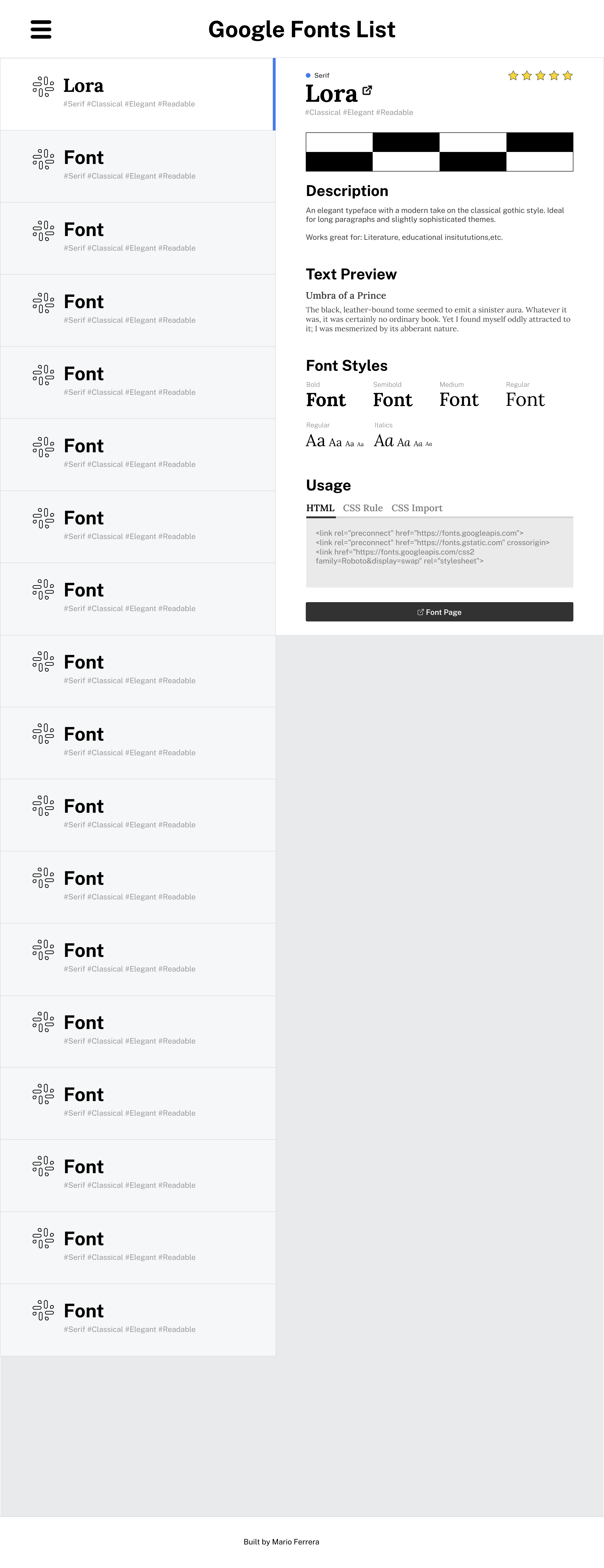
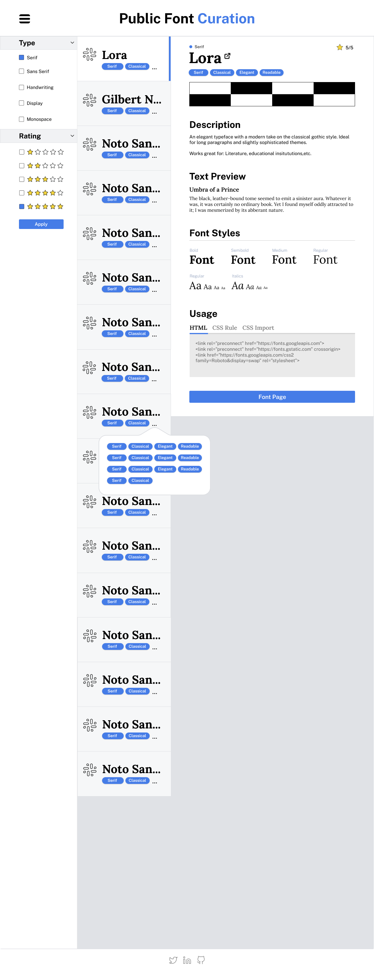
  • Researched a number of font websites and compiled a list of potential font candidates.
P4 - Development
This phase encompasses a much larger list of tasks that involve building out the frontend of the project. It ends with a MVP that has core features, hosting and domain setup, and any third-party API's plugged in and ready for deployment. Progress will typically be monitored via Github and testing will occur after site goes live.

This project consisted of full web design as well as frontend development, here is an overview of what that entailed:
  • Build folder architecture for project on local drive, store assets, and create new repository on GitHub.
  • HTML: Begin building components and pages section by section, line by line.
  • CSS: Setup the basic styling for page elements from top to bottom. Stylesheet is broken into sections based on type of content and considers KISS and DRY principles.
  • JavaScript: Build out interactable components and QOL. Used for building components like the sidebar, dropdowns, and ShadowDOM elements.
  • Accessibility & SEO: Going through a checklist of various accessibility tweaks for impaired and disabled individuals. Also carried out small SEO tweaks related to images, sections, and metadata.

Samples